Capacitor Keyboard for Lovable Apps
The first time a founder opens their wrapped Lovable app on a real iPhone, the keyboard is usually where it goes wrong. Not crashes. Worse: the message box they spent a week polishing slides under the keyboard, or the whole page jumps up and the header vanishes, or there’s a strange grey bar with arrows and a “Done” button sitting on top of the keys. In the browser none of this happened, because a phone browser handles the keyboard for you. Inside a Capacitor web view, @capacitor/keyboard decides, and its defaults weren’t chosen with your layout in mind.
This post uses @capacitor/keyboard 8.0.6, the current version on npm as of October 17, 2026.
Install it even if you never call it
npm install @capacitor/keyboard
npx cap sync
Most of what the plugin does comes from configuration, not code. You set it once in capacitor.config.ts and it changes how iOS treats your web view when the keyboard opens:
import type { CapacitorConfig } from '@capacitor/cli';
import { KeyboardResize, KeyboardStyle } from '@capacitor/keyboard';

const config: CapacitorConfig = {
  // appId, appName, webDir...
  plugins: {
    Keyboard: {
      resize: KeyboardResize.Body,
      style: KeyboardStyle.Dark,
      resizeOnFullScreen: true,
    },
  },
};

export default config;
resize and style are iOS only. resizeOnFullScreen is Android only, and we’ll get to why you probably need it.
The resize setting is the whole game
There are four resize modes, and picking the wrong one is behind most keyboard bugs we see in wrapped Lovable apps.
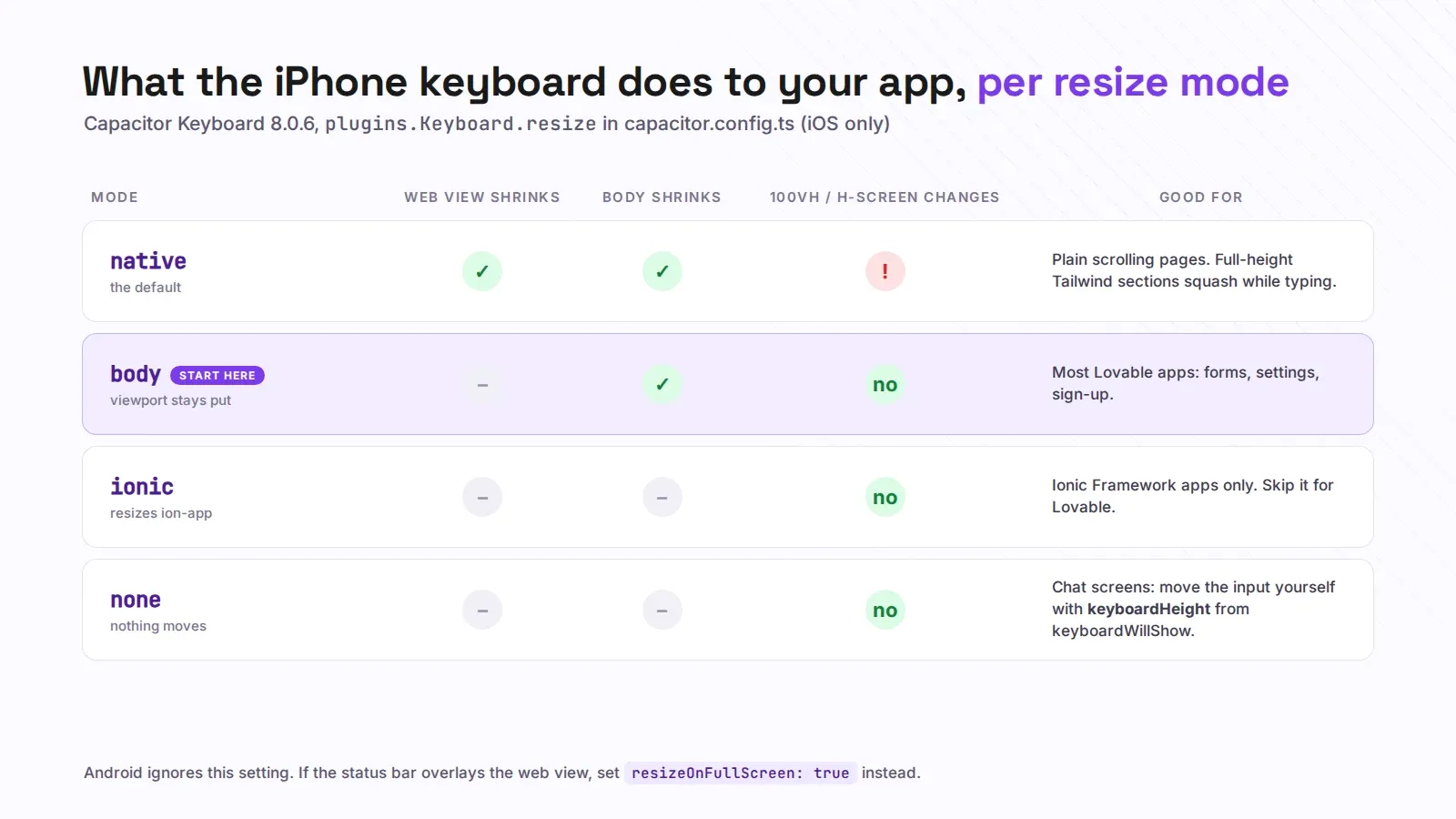
native is the default. When the keyboard opens, the whole web view shrinks. That sounds right, and for a plain scrolling page it is. The catch is that vh units change with it. Lovable builds layouts with Tailwind’s h-screen and min-h-screen all over the place, which are 100vh, so every full-height section suddenly gets shorter while the keyboard is up. Hero sections squash, flex layouts reflow, and sometimes the field you tapped gets pushed off screen by the reflow it caused.
body resizes only the <body> element. The viewport stays the same size, so vh doesn’t move, and the content above the keyboard stays where you put it. For most Lovable apps this is the one we switch to first.
ionic resizes only the ion-app element. It exists for Ionic Framework apps. Your Lovable app isn’t one, so skip it.
none does nothing at all. Neither the web view nor the body changes, the keyboard simply covers the bottom of your app. That’s useful in one case: when you want full control and handle the keyboard height yourself, which is how we build chat screens.
The chat input that disappears
A client brought us a support-chat app last month: React, Tailwind, a message box pinned to the bottom with fixed bottom-0. It looked perfect in Lovable’s preview. On an iPhone 15, in the TestFlight build, tapping the box opened the keyboard right on top of it. You could type, you just couldn’t see what you were typing. The founder’s first fix was pb-80 on the page, which “worked” on his phone and left a huge empty gap on every other one.
The reliable fix is to set resize to none for that screen and move the input yourself with the height the plugin reports:
import { Capacitor } from '@capacitor/core';
import { Keyboard } from '@capacitor/keyboard';

if (Capacitor.isNativePlatform()) {
  Keyboard.addListener('keyboardWillShow', ({ keyboardHeight }) => {
    document.documentElement.style.setProperty('--kb', `${keyboardHeight}px`);
  });
  Keyboard.addListener('keyboardWillHide', () => {
    document.documentElement.style.setProperty('--kb', '0px');
  });
}
Then the input sits at bottom: var(--kb, 0px) with a short transition, and the message list gets the same padding so the last message isn’t hidden either. You can switch modes per screen with Keyboard.setResizeMode({ mode: KeyboardResize.None }) when the chat mounts and back to Body when it unmounts, so the rest of the app keeps the simpler behaviour.
On Android, keyboardWillShow and keyboardDidShow fire almost at the same time, so don’t build an animation that depends on the gap between them. It’s there on iOS and basically absent on Android.
Android and the full screen bug
If you followed our splash screen and status bar setup and made the status bar overlay the web view, you’ve put the app in what Android considers full screen. There’s a long-standing Android bug where the keyboard then stops resizing the web view at all, so inputs near the bottom end up under the keys. That’s what resizeOnFullScreen: true works around. It’s off by default, and we turn it on in every Android build that overlays the status bar. It costs nothing when the bug doesn’t apply.
The small stuff people notice
The grey bar with arrows above the iOS keyboard is the accessory bar. On a two-field login form it’s clutter. Turn it off with Keyboard.setAccessoryBarVisible({ isVisible: false }). That one only works on iPhone, so wrap it in a platform check rather than letting it throw on Android.
style controls whether the keyboard is light or dark. Leave it out and it follows the phone’s appearance, which is usually right. Set it only if your app has a fixed dark theme and a bright white keyboard pops up underneath it looking like a different app.
And Keyboard.hide() is the thing you call after the user submits a search, so the results aren’t hidden behind a keyboard they no longer need. Keyboard.show() exists too, but only on Android, and auto-opening the keyboard on a screen load annoys people more than it helps.
None of this shows up in the Lovable preview, so test the keyboard on a real phone before you send a build to review. If your wrapped app already has the vanishing input problem, or you’d rather someone else wired the keyboard up properly, send us the details and we’ll take a look.