iOS App Icon Size for a Lovable App (2026)
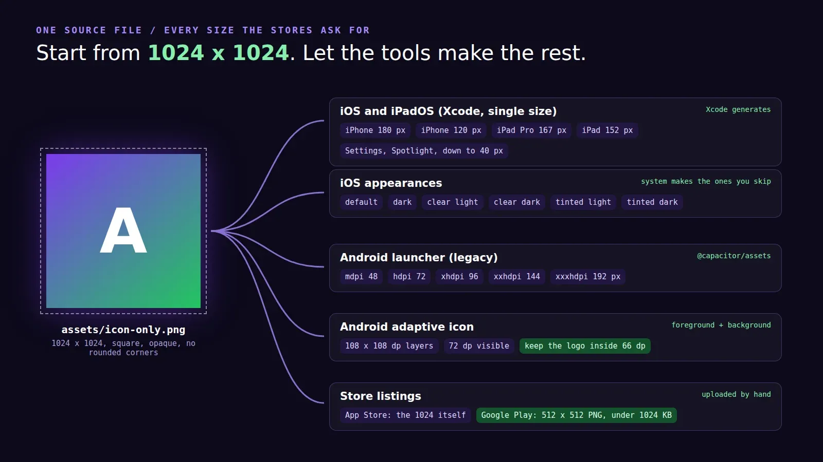
The iOS app icon size is 1024 x 1024 pixels, one square image, and Xcode makes every smaller size from it. Don’t round the corners, don’t add a shadow, and keep it opaque. iOS applies the rounded mask itself. That’s what Apple’s app icon guidelines and Xcode’s icon docs say as of October 2026, and it’s the same answer for iPhone and iPad.
That part is simple. What trips up Lovable founders is everything around it: where the 1024 file comes from, the new appearance variants, and the Android side, which has its own rules.
Your Lovable project doesn’t have one
A Lovable app ships a favicon.ico, maybe a 512 px PNG for the web manifest if someone asked for it. None of that is a 1024 icon. The tempting move is to scale the 512 up. Don’t. On a Pro Max home screen the icon is drawn at 180 px, which hides the blur, but App Store Connect shows the full 1024 on your product page and a blurry icon there looks like a scam app.
We had a founder last month whose only copy of the logo was the favicon, 64 pixels. The designer who made it had left. We rebuilt the mark as an SVG in about forty minutes (it was two shapes and a letter) and exported from that. If your logo is simple, that’s faster than hunting for the original file.
What iOS does with the 1024 square
Since Xcode 14 the default for a new app is a single size icon: you drop one 1024 x 1024 image into AppIcon in the asset catalog and Xcode generates the rest. You can still switch the asset to “All Sizes” and hand-draw the small ones, which only matters if your icon has fine detail that turns to mush at 40 px.
For reference, these are the sizes it’s generating for you:
- iPhone home screen: 180 px (60 pt at 3x) and 120 px (60 pt at 2x)
- iPad: 152 px, and 167 px for iPad Pro
- Spotlight, Settings and notifications: smaller ones, down to 40 px
Then there are appearances. People can set their home screen to default, dark, clear or tinted icons, and Apple’s spec table lists six variants for iOS (default, dark, clear light, clear dark, tinted light, tinted dark). You don’t have to make them. Per Apple’s guidelines, “the system automatically generates variants you don’t provide.” If you do want a hand-made dark icon, Xcode wants it with a transparent background so the system’s dark background shows through, and the tinted one as a grayscale image.
The newer route is Icon Composer, which ships with Xcode. Instead of one flat PNG you bring in layers (a background and one or two foreground shapes, SVG preferred) and it renders the Liquid Glass highlights and all the appearances from them. Apple refined that guidance again on June 8, 2026. For a first release from a Lovable app, honestly, a flat 1024 PNG is fine. Do Icon Composer when you have a designer and a reason.
The upload error you’ll probably see once
If you export a flat PNG with transparency (easy to do from Figma or Canva if the background layer is hidden), the build can fail at upload with Apple saying the App Store icon can’t be transparent or contain an alpha channel. The fix is to flatten it onto a solid background and export again without alpha. On a Mac: open it in Preview, File > Export, untick Alpha. Takes ten seconds once you know.
Android and Google Play are separate
Android doesn’t use your 1024 square directly. It wants an adaptive icon: a foreground layer and a background layer, each 108 x 108 dp, of which only the middle 72 dp is ever visible, because each phone maker crops it to its own shape (circle, squircle, teardrop). Keep the logo inside the central 66 dp or it gets clipped on some phones. Android’s adaptive icon guide has the template.
The Google Play store listing icon is something else again: 512 x 512, 32-bit PNG, alpha allowed, under 1024 KB, per Play Console help. That one you upload by hand in the store listing.
How we generate all of it in a Capacitor project
For Lovable apps going to the stores we use Capacitor, and Capacitor has a tool that does every size in one command: @capacitor/assets (version 3.0.5 at the time of writing). Put the source files in an assets/ folder at the project root:
assets/
  icon-only.png         at least 1024 x 1024, iOS and the legacy Android icon
  icon-foreground.png   at least 1024 x 1024, Android adaptive foreground
  icon-background.png   at least 1024 x 1024, Android adaptive background
  splash.png            at least 2732 x 2732
  splash-dark.png       at least 2732 x 2732
Then:
npx @capacitor/assets generate --ios --androidIt writes into ios/App and android/ for you. If you only have a logo and no time, its “easy mode” takes the logo plus background colours (--iconBackgroundColor '#0b0b12') and builds the icons and splash screens around it. It looks a bit generic, but it’s a perfectly good first version, and nobody has been rejected for a plain icon.
One thing to remember: Lovable never touches the ios/ and android/ folders, so regenerating icons is your job (or ours) each time the logo changes, not a prompt.
If you’d rather not deal with any of this, icons and splash screens are part of every Lovable to App Store package we do, and the home page has the prices.